Aurora Australis 2
I have adapted this post, largely crediting the explanation provided online by Dr Stephen Voss, from Central Otago in ‘Aurora- The Jargon Explained’. Some links have lapsed since first published, and I have tried to re-establish as best I can what what I know.
How is Auroral Activity Monitored in Real Time, and How Can we Predict When an Aurora Might Appear?
OK, so there are a heap of scientists who monitor this. Subsequently a lot of space science is directed at this, given the effect space weather has on space exploration, satelittes, communications, GPS etc. Much of this is publicly available, via various online graphs and charts. Let’s start at the sun and work our way out from there. We are lucky to have several spacecraft dedicated to watching and recording activities on the solar surface, in the solar atmosphere, and surrounding space.
1) Observing Solar Flares: Solar Dynamic Observatory (SDO)
NASA’s Solar Dynamic Observatory provides near real-time views of the sun at different wavelengths. For the most part these images will all look pretty similar from one hour to the next, but the appearance of a bright solar flare will quickly become visible on these images. Here’s an example of a bright flare close to the left edge of the sun

2) Measuring Solar Flare Intensity: GOES (Geostationary Operational Environmental Satellite) X-ray Detector
It is also possible to view a graph of x-ray radiation intensity at the suns surface recorded by (currently) the GOES 15 satellite. This provides a time-line of solar flare activity, updated in real time. Solar flares can be classified by intensity. C-Class flares are weak, M-Class flares are moderate, and X-class flares are of extreme intensity. Here’s an example of two X-class flares over a period of just three days back in July 2000:

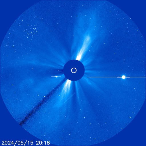
3) Observing a CME: SOHO (The Solar and Heliospheric Observatory) Coronagraph
The SOHO spacecraft provides views of the sun in several wavelengths, but more importantly for us, it has an instrument onboard called a coronagraph which allows a detailed view of the suns outer corona. This allows us to see the passage of a Coronal Mass Ejection (CME) into space. Here’s an example of a CME being expelled from the eastern limb of the sun (left
side of the image) . The black disc in the centre of the image is a cover which blocks out the intense light from the sun’s surface allowing the detail of the outer corona and solar wind to be observed. The “movie theatre” link on the SOHO page is especially good for creating animations of the ejected CMEs.
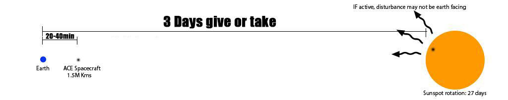
4) Monitoring the Solar Wind – The Advanced Composition Explorer Spacecraft (“ACE”)
This spacecraft sits between the Earth and the Sun at a distance of 1.5 million km and monitors the solar wind. Once again, the data is available as a near live feed. A number of solar wind parameters can be measured, but the important ones for us are wind speed, wind density, and intensity / direction of the imbedded magnetic field (yes, the solar wind has it’s own magnetic field). Here’s an example from 2012 which shows the impact of a CME with the ACE spacecraft. The yellow line is wind speed, the orange line is density, and the double line (white and red at the top) is the magnetic field density and direction. You can clearly see the results of the CME impact just after 1100 hours UTC. There is a sudden jump in all of these three parameters.
Of all these parameters, probably the most important is the red line at the top, the so-called Bz (pronounced “Bee-zed”). It is a measure of just the south pointing component of the magnetic field within the solar wind. The more south the magnetic field, the more negative the red line goes. The more negative the Bz, the better – a south pointing magnetic field interacts with and minimises the protective effect of Earth’s own magnetic field. With the Earth’s protective barrier weakened, more particles can penetrate into the upper atmosphere, and the chances of aurora increase significantly. A strongly positive Bz (north pointing magnetic field) will shut down the aurora in a blink. The white line (Bt) is a measure of the total magnetic field intensity irrespective of direction. Bz can never be greater than Bt.

5) Observing the effect at Earth – Magnetometers
Finally we have the effect of the impacting solar wind on Earth’s magnetic field. When the disturbance finally arrives there can be quite a shake-up of the Earth’s own magnetic field, and this geomagnetic disturbance can be measured on a device called a magnetometer. Magnetometers measure variations in the intensity and direction of the local magnetic field, a sort of “seismograph” for geomagnetic disturbances.
Piecing It Altogether – Predictive Tools
So, we have the ability to observe when a solar flare occurs, and to determine if a coronal mass ejection has been hurled in our general direction as a result. We also have the ability to observe the passage of this disturbance as it gets closer to Earth and we can see the effects that this has on Earth’s own magnetic field. How can we piece this all together to provide an accurate prediction? We have several useful online tools to help us:
1) The Kp Index **
Ultimately what all of this solar wind stuff does is to rattle up the Earth’s magnetic field. The more rattled, the more chance of aurora appearing. The Kp index is a measure of the severity of global magnetic disturbances near Earth. The Kp scale ranges from 0 to 9, with 9 obviously the most intense disturbance. For those of us in high-middle latitudes such as southern New Zealand or Tasmania, a Kp level of 5 will frequently be associated with visible aurora. The US Air Force use a predictive algorithm to make an educated guess as to what the Kp index will be in the future based on (amongst other things) the various solar wind parameters discussed above.
2) NOAA Ovation Aurora Forecast Model
This map attempts to take all the raw data available and then plots the probability and predicted location of the aurora from that data. The map is reasonably self explanatory. As the red “view line” gets closer to your location, the greater the chance of you seeing something. It’s worth noting however a number of brief auroral outbursts have been viewed when the view line was still plotted further south.

3) GOES-16 (Geostationary Satellite) Magnetometer Tracings and Prediction of Substorms (The “Cloake Effect”)
Long time aurora observer and Timaru based photographer Geoff Cloake was first to note an apparent pattern of auroral rays briefly appearing in association with sudden upswings in the GOES magnetometer tracing (the blue line in the tracing below). This effect has subsequently been observed on numerous occasions, and has proven extremely useful in helping some diehard observers to position themselves in a dark location just as a brief auroral substorm makes an appearance.
Credit :
Dr Stephen Voss, ‘Aurora- The Jargon Explained’, March 2015 v3
**Why the kP index is mostly (but not entirely!) irrelevant in NZ & Australia
Source – Southern Hemisphere Aurora Group – David Hunter
Background Physics
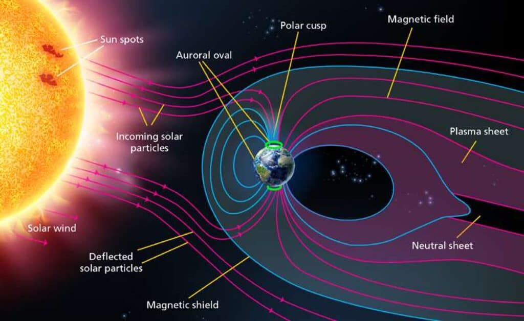
The incoming solar wind collides with atoms in the Earth’s ionosphere (in the upper atmosphere), ionizing them (hence the name “ionosphere”). Ions are atoms that have lost or gained an electron, and so have an electrical charge. Thanks to Michael Faraday’s Law of Electromagnetic Induction, we know that wherever an electric field exists, a magnetic field also exists. In the ionosphere, the ionisation caused by the solar wind disturbs the Earth’s natural magnetic field, making it stronger closer to the poles.
We measure this magnetic disturbance with ground- and space-based magnetometers.
What is the kP index?
The “k-index” is a measure of the level of disturbance of the Earth’s magnetic field. These are measured by ground-based magnetometer stations.
These are often referred to as kH, kL, and kC… these are the k-indices for Hobart (kH), Launceston (kL), and Canberra (kC). In the United States, America, and Europe (and in almost every aurora app I’ve seen), they refer to kP instead. kP is simply an average value of the k-indices of eight different magnetometer stations: four based in North America, three in Europe, and one in Australia (Canberra). The P in kP stands for “Planetary”.
What’s wrong with kP?
There are two issues with the kP index as far as NZ / Australia is concerned:
-
kP is calculated from eight magnetometers. Seven of those eight magnetometers are in the Northern Hemisphere. Just one is in the Southern Hemisphere, in Australia. This selection bias can cause the kP value to be vastly different from a local southern hemisphere k-indices (kH, kL, kC, etc.).
-
During our Summer, the Earth is tilted such that the Northern Hemisphere (during our day time) is tilted away from the Sun – so the northern magnetometers are actually tilted toward the equator and so end up being more so in the “firing line” for the solar wind colliding with the Earth following magnetic reconnection. (i.e. the night side of the Earth always gets more solar wind than the day side, and because the northern magnetometers are tilted into the night side of the planet more, the effect of the aurora is stronger on these magnetometers during our Summer). Meanwhile, our own magnetometer in Canberra is tilted up into the Sun more, and so the solar wind misses that magnetometer – the auroral effects are reduced on the Canberra magnetometer at day time during the Summer. So you end up with enhancement of northern magnetometers (7 of the 8 magnetometers used to calculate kP) and a reduction in the Canberra magnetometer, making the kP index even more biased. Consider then what happens in winter, the opposite occurs and the Canberra magnetometer becomes more relevant, but it is still only one of eight magnetometers, so there is still that bias at play.
kP Index Forecasts
Note that the kP index (and the local k-indices) is a measure of past magnetic field activity – it is not a measure of what will happen in future. Therefore, the kP index (and local k-indices) are useless for forecasting auroras.
That said, it is possible to forecast the k-indices and kP index.
The kP forecast (officially called the USAF Wing-kP Model) is based on ACE/DSCOVR spacecraft magnetometer data and not the eight ground-based magnetometers used for calculating the kP index itself. Therefore, the kP index forecast is useful for predicting general trends in the local k-indices (e.g. if the kP forecast is for increased magnetic disturbance, a local k-index value should experience an increase in magnetic field disturbance if the forecast was correct). However, the exact values of the kP index forecast cannot be substituted for local k-index values due to the hemispheric and tilt biases I explained earlier.
What the kP index is good for
1. kP is good for America and Europe, because there is a greater landmass in the northern hemisphere, and a greater number of magnetometers in that hemisphere (so the kP average is biased towards northern hemisphere values).
2. The USAF Wing kP Model (kP forecast) is also useful for forecasting magnetic field disturbance in space where satellites operate. The United States operates numerous defence, communication, and science-related satellites. All of which can be effected by space weather, hence the USAF’s involvement in space weather forecasting.
3. As explained above, the kP forecast can be used to forecast general trends in local k-indices. However, keep in mind that a k-index is a measure of PAST magnetic field activity: it cannot and should not be used to try to predict auroral visibility in specific locations at specific times.
Summary
Simply put, the k-index is the measure of the disturbance of the Earth’s magnetic field at a particular location on Earth, as caused by solar activity and subsequently, aurora.
For southern regions, a localised k index is a better indication, than the broader kP index, which is essentially a global average . Regardless of source, any k monitoring records the activity that has just happened as solar wind hits earth.
Noting, that the bulk of the magnometers that produce the kP index are located in northern hemisphere. Subsequently, the activity they pick up may not equate fully to auroral activity in the south. This is due in part to natural variations of earth tilt (our seasons), as well as directional differences of electrons sweeping past earth. Not all ‘hits’ of solar wind from the sun reach earth equally or directly.
So by choice, the kP index is a adequate, but broad indication of current auroral activity.
Much better for us wanting to see Aurora in the south, is the use a ‘localised’ k source, such as Hobart.
Yet does not always equate to future aurora activity.
If activity using the k / kP index shows a heightened reading, there are additional graphs, observations and data that can be used to provide greater analysis, that we can use to anticipate any incoming space weather. Subsequently, any upcoming auroral possibility still to eventuate.
These additional graphs, data, observations and readings are much better indicators of the likelihood of seeing (or photographing) auroral activity, as this data comes further out from various satellite & solar monitoring sources. So can give us some forewarning ranging from minutes to days. I’ll explain some of these in the next posts.